At the end of June, 8 months before P-day, we started having conversations about the cover artwork. The plan was for the hardback cover to be a “PPC” or printed paper cover rather than a flyleaf. Given the sad state of the flyleafs (or is it ‘flyleaves’?) of books I own, I was pleased about this.
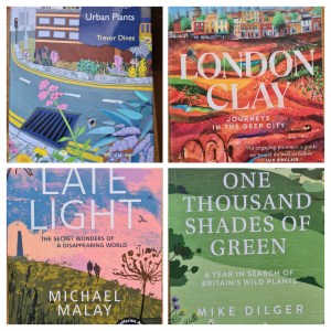
I sent four examples of recent book covers I’d liked to the publisher and noticed they all had a collage look to them (see below). I also sent examples of ones I wasn’t keen on which had a number of features in common too, including gold text which was hard to read, overly complicated illustrations or styles which I didn’t think fitted the tone of my book.
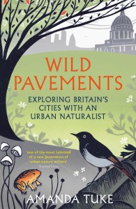
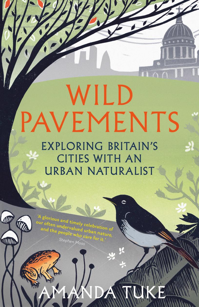
I also suggested some of the things which I’d like featured on the cover – like a black redstart, rue-leaved saxifrage, a pavement, St Paul’s for example – while fully aware it was a long list so they couldn’t all be on it or it would be a total mess.
Seven months before P-day, I was sent four illustrators to consider. My commissioning editor and I were in agreement about the work of an illustrator, Rach Appleby. Rach had a number of bird-related pieces of artwork in herportfolio and Claire and I liked the linocut/collage effect she uses. My wishlist for content was sent to Rach for consideration.
Six months before P-day, Rach sent over a draft of the artwork. There was lots I liked about it, in particular the layout and colour palette, but also some things which needed tweaking so that it looked urban enough and the animals, plants and fungi were accurate enough to not be confusing.
A couple of weeks on I was sent a revised cover design which looked amazing (see below) and was definitely something for us all to be proud of. I gave a big social media shout-out to Rach Appleby on National Illustration Day the following month. At this stage it had a placeholder endorsement borrowed from some text which the fab nature writer Stephen Moss wrote about me for my book proposal. The next step was to decide on an endorsement which would be perfect for this cover.